SPECTRUM 2 FACTOR AUTHENTICATION
| ROLE
| DURATION
| TEAM
| TOOLS
UX/UI Designer
10 Days
June 2020
Scott Mahlmeister
Joy Bishop
Maggie Henderson
Sketch
Miro
Trello
Overview:
Quick discovery effort exploring how, now that Spectrum offers multi-factor authentication, how can we communicate and encourage customers to enable and set it up for their account prior to a successful login?
Solution:
Offering enrollment or setup of 2-factor authentication requires a private session in order to associate an account with the secondary authentication method. Credentials are required to establish any further security measures and assign them properly.
OVERVIEW
The Identity Team of Charter Communications requested our team allocate design resources and knowledge to an exploration of how to let users enable and setup two-factor authentication possibilities on the Central Login Page for residential cable customers.
PROBLEM
Customers reaching the residential login page of the Spectrum website have likely a handful of goals in mind, be it paying a bill, reviewing services, adding services, or modifying their plans. Most customers likely only login once a month to pay a bill after they have set up their account, but their accounts still would benefit from added security not only for PCNI protection, but also their payment systems and personal information.
Where can we fit in an opportunity to take the customers from the sign-in page to get two-factor authentication set up? How can we convince them while potentially interrupting what they want to do (i.e. sign in)? What is the least intrusive way to let them know about the security benefits and get them to pause their desired use of the website to add more work for them in the long term? Is it even possible to get this step on the central login page?
PROCESS & ROLE
Research | Design | Define | Refine
I began my work by researching various methods other websites, platforms, and apps offer end-users the option of setting up and enabling 2 factor authentication. I also considered how some websites offer mobile users applications, or sites that offer users the option to subscribe to a newsletter.
Looking at all of the options available, I also spent time looking into user feedback on some of these options. The "Reddit Model" puts out not only a pop-up offering the user to use the app, but also leaves a banner, and often even restricts access to the user-created and curated content unless mobile users are on the application. While this has gotten their app to 50 million Play store downloads, it has earned distaste from users and reflects a transparent use of dark UX design. This is not the approach we want to put on customers who are already likely only visiting the website just to pay a bill.
To answer the initial task of getting users to enroll in this option from the initial login screen, I began with looking at different calls-to-action. I recognized that this would likely not be used and did not seem to make sense as one authentication is required to enable a second, so then I considered a blocker screen that would display in between signing on and being directed to a user dashboard.
I initially shared these early designs 3 days after the project was assigned, and got lots of feedback about the best approach once we determined that informing people of the option to opt-in would have to be disruptive.
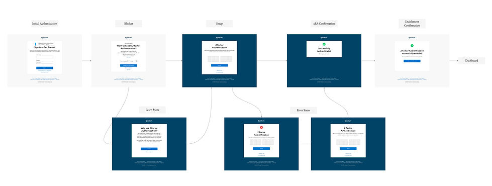
THE SOLUTION
The final solution I was able to propose in my short tenure with the project was to produce an informative banner prior to initial sign on and authentication, and then a one-time interruption screen between successful sign-on and redirection to the user dashboard.
KEY INSIGHTS
AUTHENTICATION STEPS HAVE LOGICAL NUMBERING
Users must have signed-on before they can entertain the idea of enabling a second-authentication measure.
LOGGING IN HAS A SINGULAR PURPOSE
It is disruptive to interrupt that--and potentially dangerous to customer satisfaction. How can we balance disruption for an option that ultimately benefits both the end-user and the company with convenience and usefulness?
END-USERS NEED CONFIRMATION
Setting up a new security feature is not dissimilar from setting up a new physical alarm system--users don't always have confidence it is complete and done if they are not being told they are entirely completed with set up.
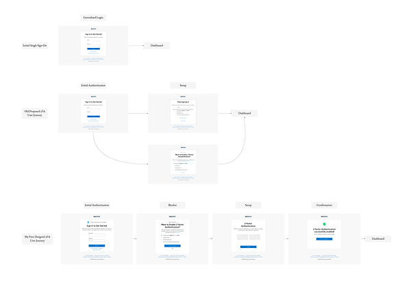
MAPPING THE JOURNEYS
Mapping out the steps of traditional sign-on, followed by a potential sign-on informing users was a good learning experience to think about all of the details of the journey.
Additionally, creating a flow where they could sign up for 2 factor authentication, and then a flow of traditional sign-on with 2 factor authentication compounded on the learning experience of the practicality of in-depth customer journey mapping and explication of user flows.
ITERATIVE DESIGNS
.jpg)
FINAL PROPOSAL
NEXT STEPS
I was sad to see my time with Charter Communications come to an end prior to getting to see this delivered to the Identity Team and presented for potential future development or implementation. I was able to pass off my work to my team's designer with the hopes of getting to add it to the backlog for the Identity team to execute alongside team responsible for the ID micro site.